Ok I might be a little bit late to jump onto the Games Workshop Contrast Paint review bandwagon. But the hypetrain reached me too, I bought some colours and managed to test them. This won’t be a full review by a professional painted on how to use those new colours. But I will try to describe my first impressions.
I went into my local GW store last tuesday. So I was already late to the party not having preordered any colours. But they had the whole range in store and I bought a few pots to give them a try. The shop owner told me not rage in case I didn’t like the results, but to come back and let them teach me on how to use the contrast paints.
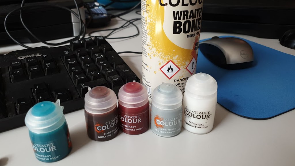
So I bought the following items:
- a can of Wraithbone primer
- Guilliman Flesh
- Blood Angels Red
- Apothecary White
- Aethermatic Blue
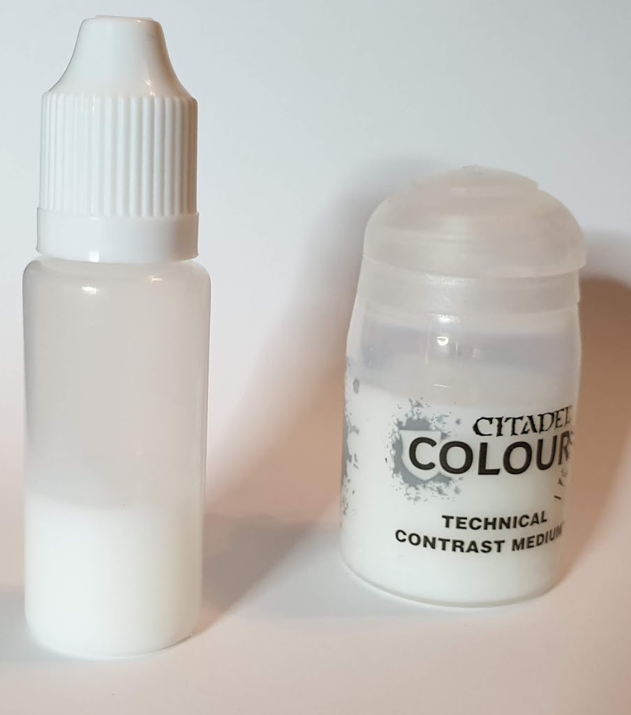
- Contrast Medium
First impression: this stuff is costly. All of the above set me back about 50€. But I needed white primer anyway.
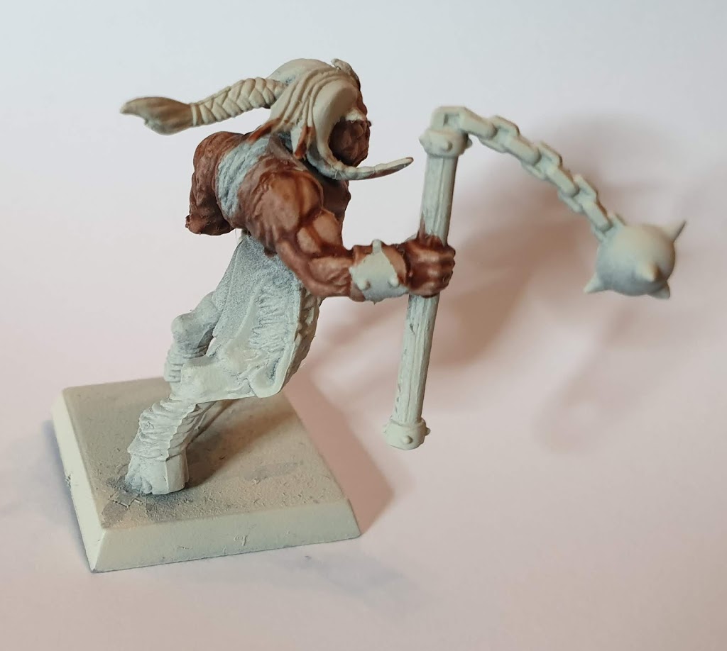
To test these paints I reprimed some old models. Beware that this might influence the outcome of the look. All of the models in this post where previously primed with GW Corax White primer. I sprayed the Wraithbone over the old primer layer and I don’t think I got 100% coverage going with white over a white surface. So some of the effects on the miniatures might be a result of an uneven application of the new primer.
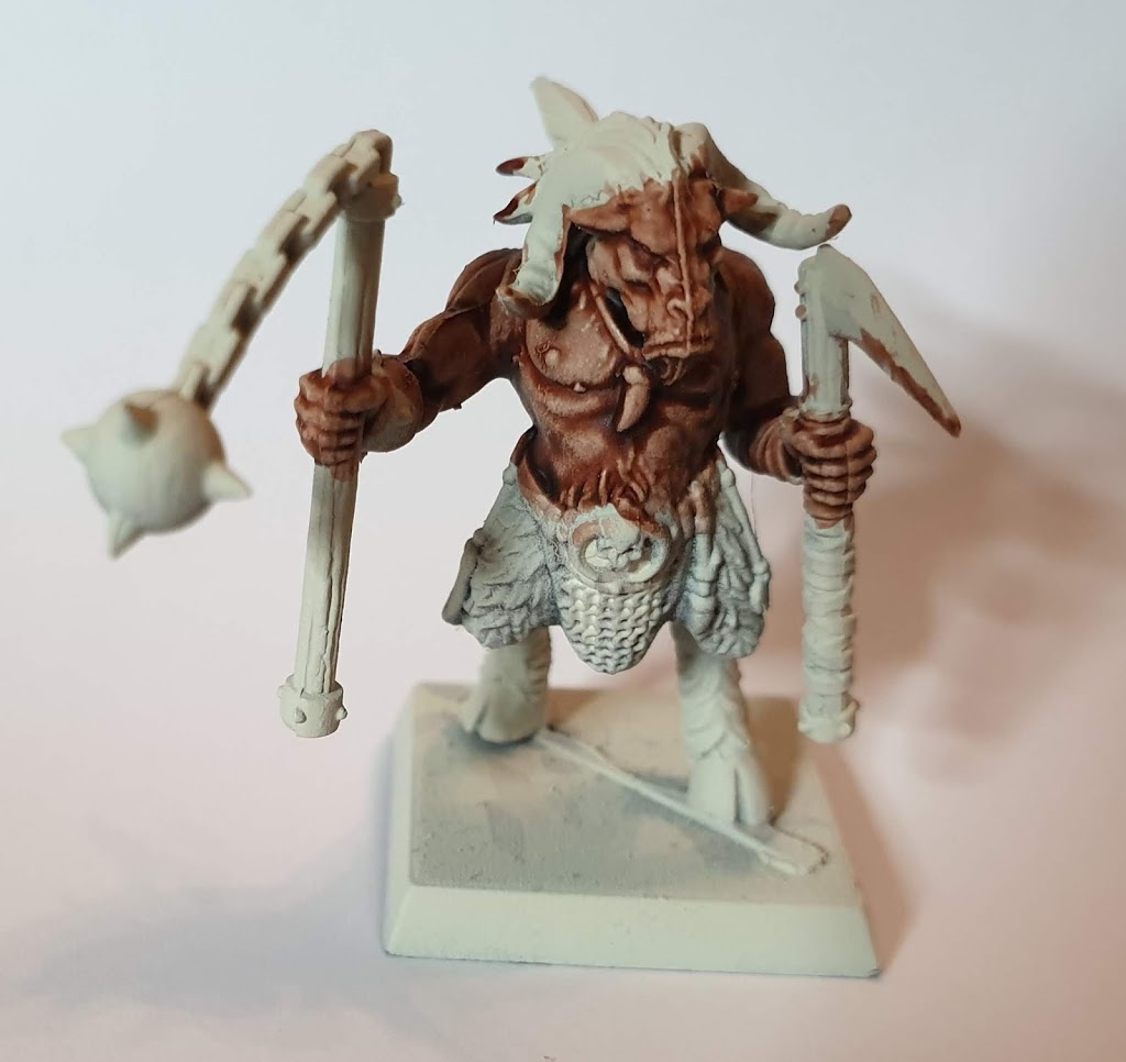
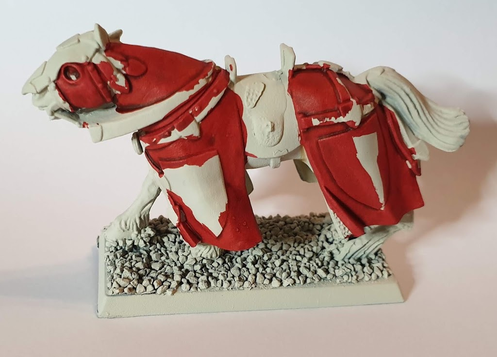
The first model I painted was a Beastmen Gor. I used the Guilliman Flesh on his torso and head. I painted a few Gors in the past and the torso and head was always the part which required the most time. So I hoped that Contrast Paints might speed up the process,
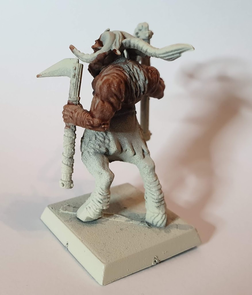
Application went smoothly. But I already discovered that you have to paint very differently with Contrast Paints:
- The paints are very runny and you need a whole lot of brush control to get them where you want them – or better to not let them get somewhere you don’t want them to got. I don’t have the Wraithbone colour pot, I everything that does not hit the flesh of the upper torso will be visible if you paint with a lighter colour over it later (assuming using Contrast Paints).
- I was not sure if I should follow the advise of “only one thick coat” or use the colour in a slightly more controlled manner. So I opted for the cautious approach and put as much colour onto my brush as I would use for a wash.
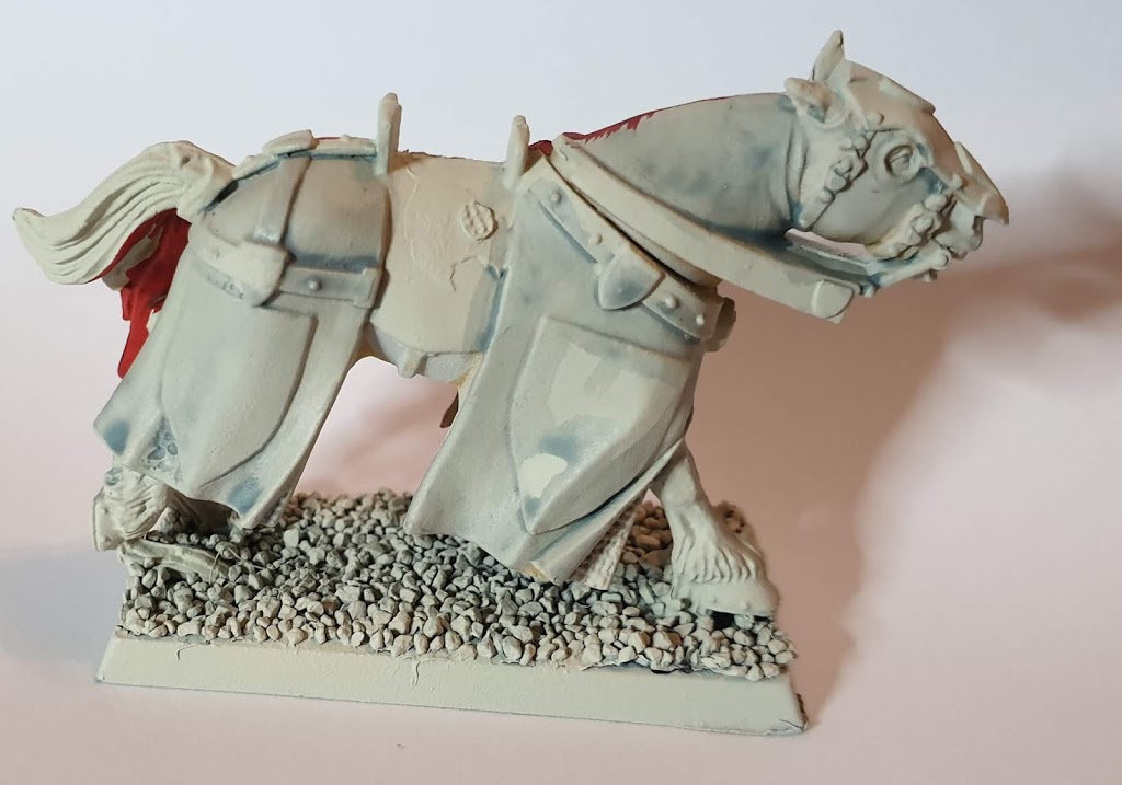
- paint over the model with GW Nihilakh Oxide (out of the pot or mixed with Lahmian Medium) and drybrush
- paint over the model with GW Hexwraith Flame and drybrush
- paint over the model with Nighthaunt Gloom and drybrush
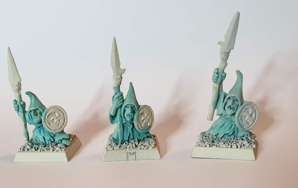
From left to right I painted the models:
- Aethermatic Blue straight of of the pot
- two brushes Aethermatic Blue and two brushes of Contrast Medium
- 1:3 mix of Aethermatic Blue and Contrast Medium
The one on the right was the colour and shading I was looking for. Better on the backside than on the front. But I’m very happy that I get this kind of result from the paints.

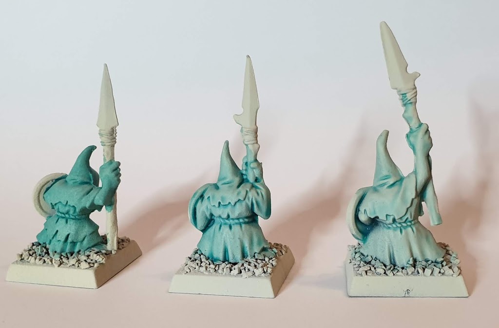
Only thing I had to do was to transfer the colours from the pots into dropper bottles. I hated the seconds try – two brushloads full of medium and two brushes full of paint, like they do in the GW videos. With the medium being transparent, I cannot see how much of it I have on my palette. So for the third miniature I filled to dropper bottles I bought some time ago (for decanting the normal colours into dropper bottles – see here for more info), and just squeezed out six drops of Medium and two drops of Blue. This was also the amount of painted I needed for one Goblin – 8 drops in total.
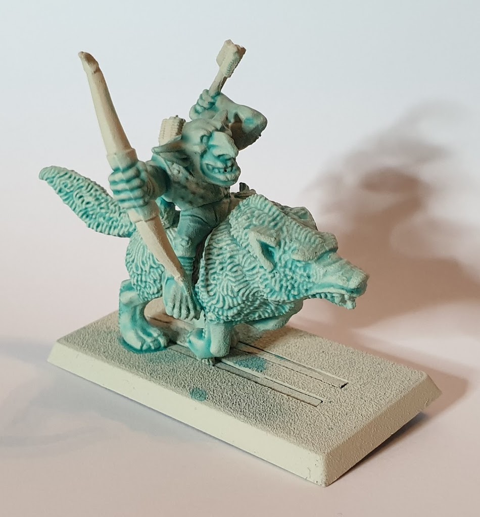
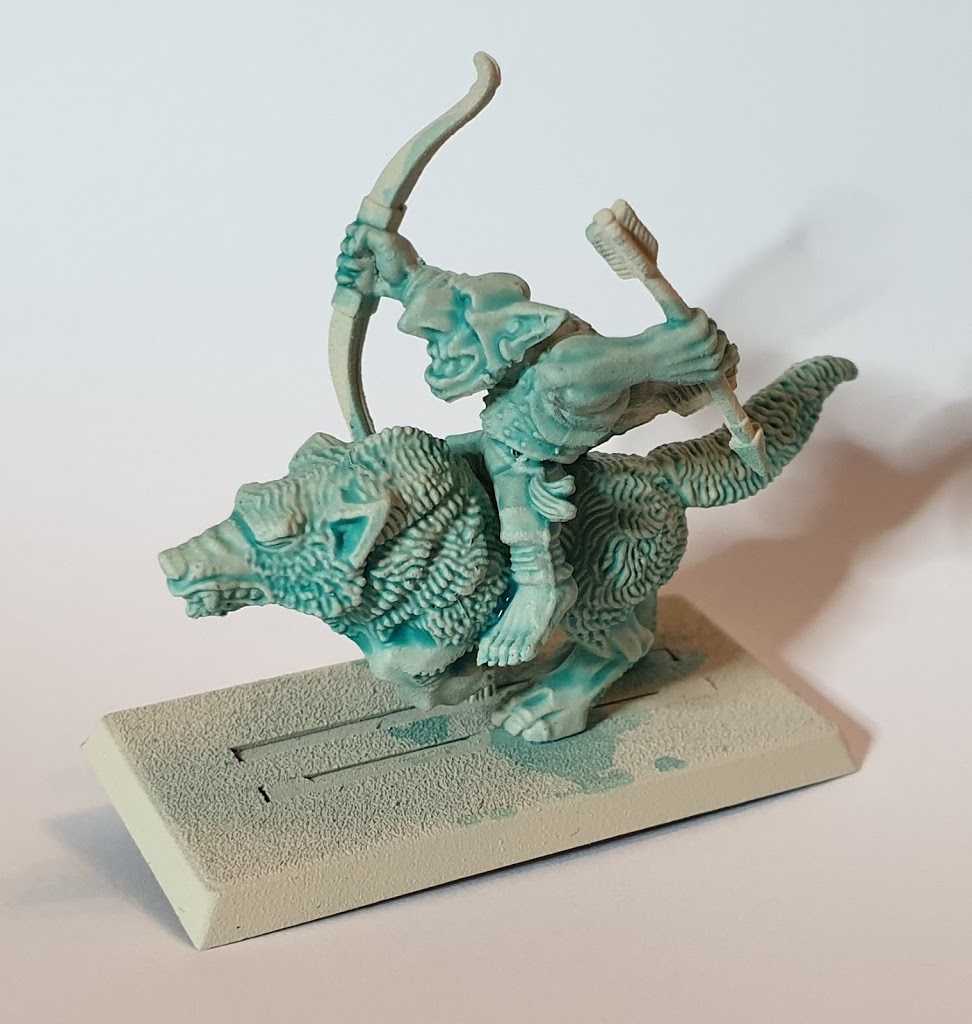
Last test was a ghostly Goblin Wolf Rider. I wanted to test the blue 1:3 receipe on the wolf and his fur. I think that worked. So I’m quite happy with the result here.
One last thing I noticed was that the bristles of my brushes were very hard after they had dried. I used the paints on one evening and went on to test the goblins the next evening. I already have this effect when using GW Shades. If I don’t wash out my brush very carefully they get very stiff. But these paints produced an even harder brush. So after my second evening I tried to wash them and rinse them in soap, but they were hard again after they dried. I have to take a look at how to clean the brushes – and not use any brushes of value on those new colours.
Verdict:
I’m not convinced. The blue and medium mix I’ll definitely use for my goblin – maybe with even more medium. The flesh and white I’ll have to try again. Contrast Paints don’t like flat surfaces. So I think I am going to get some browns for furs and maybe a yellow if it’s coverage is anything like the red.